


OBIZ TOWER
STRIPED LOBBY
The lobby of a multi storey office building is a place that people cross every day to go somewhere else. It is often a stage of a journey or a place for an encounter, but rarely a final destination. For these reasons a lobby is a space with a very pragmatic identity: a uniform background witnessing the daily stream of business. The project for the Obiz Tower Lobby challenges all these ideas: it aims to create a space full of identity using a highly visible and recognizable pattern. It is a Seventies’ Show set design or a striped renaissance Cathedral, a shot of color on a grey concrete canvas.
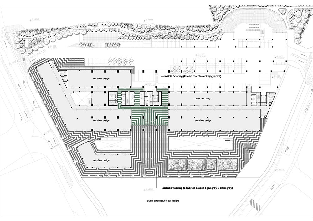
To enhance the graphic features of the project, we used a striped tridimensional pattern that goes well beyond the limits imposed by the interior space. The pattern starts on the pavement of the public plaza around the building, and it leads the users towards the main reception area. The stripes work as a filter: they collect the visitors from outside and redirect them towards their final destination within the building. The lobby becomes a landmark, a geometric progression, where a simple design feature is used to organize all the elements of the space: floor, walls, ceilings but also furniture and lighting. Diverse but uniform.
The lobby is more than 11 meters high, so we decided to lighten up the construction of the higher areas, without compromising the pattern composition. The project was realized alternating two different kinds of stone, green oriental marble and gray granite, for the floor and the lower parts of the walls; while for the high walls and the ceilings we used punched metal panels in two colors and different patterns. It all comes down to a 60x60 cm construction grid, which makes the project completely modular and eventually adaptable to different locations.
고층 건물의 로비는 건물을 사용하는 사람들이 매일 거쳐가는 장소이다. 종착지를 가기 위해 거쳐가는 장소이자 만남의 장소지만 최종 목적지인 경우는 거의 없다. 이러한 이유로 로비는 매우 실용적인 기능을 가진 공간이다. 비즈니스의 일상적인 흐름을 목격하는 균일한 배경이 된다. 오비즈 타워 로비 (Obiz Tower Lobby) 프로젝트는 이러한 모든 생각에 도전장을 내민다. 사람들에게 익숙한 눈에 잘 띄는 패턴을 이용해 정체성이 가득한 공간을 만들고자 했다. 70년대 쇼 세트 디자인이기도 하고 줄무늬 가득한 르네상스 성당이기도 하다. 회색 콘크리트 캔버스에 컬러를 더한 작품이다.
프로젝트의 그래픽적 기능을 향상시키기 위해, 우리는 실내 공간의 한계를 뛰어넘는 3차원의 줄무늬를 패턴으로 사용했다. 건물 외부에 있는 공공광장의 바닥에서 시작하는 패턴은 사용자를 주요 리셉션 구역으로 안내한다. 이 줄무늬는 필터로 작용한다. 외부에서 방문자를 수집하여 건물 내 최종 목적지로 다시 안내한다. 로비는 랜드마크가 되고, 기하학적 진행이 된다. 단순한 디자인 기능을 이용하여 바닥, 벽, 천장은 물론 가구과 조명에 이르기까지, 모든 공간의 모든 요소를 구성한다. 다양하지만 균일한 형태로 말이다.
로비 높이가 11미터가 넘어서 우리는 패턴의 구성을 손상시키지 않으면서도 공간 상부 구조물을 밝게 만드는 것에 중점을 두었다. 바닥과 벽의 하부에는 녹색 동양 대리석과 회색 화강암, 이 두 가지 종류의 석재를 번갈아가면서 사용하였다. 벽면의 상부와 천장에는 타공 철판을 사용하였고, 철판에는 석재와 동일한 두 가지 색상이 적용되었다. 이 모든 것은 60x60cm 크기의 그리드로 구성되었기 때문에 프로젝트는 완벽히 모듈화된 상태로 존재하여, 궁극적으로는 다른 위치에서도 똑같이 적용이 가능한다.
Project: anDstudio (Luca Villa) + MOTOElastico
Design Team: Luca Villa (leading architect) + Simone Carena, Marco Bruno, Minji Kim, Juneho Kim, Quentin Leroy
Location: Anyang, South Korea, 2013-14
Photo by: Ulla Reimer
Published on: Tmagazine